Sometime last year, the Shop & Shop and Giant (of Landover) grocery store chains began introducing redesigned packaging for their store brand products. The two chains share a parent company and share branding, so the labels only use the shared logo without a brand name. The old label designs heavily featured a white background, which made them easy to locate in the store.1 The new brand identity is less distinct, but whether it’s better or worse is a matter of taste. However, there are specific design decisions that were made on some of the labels that have fundamental issues.
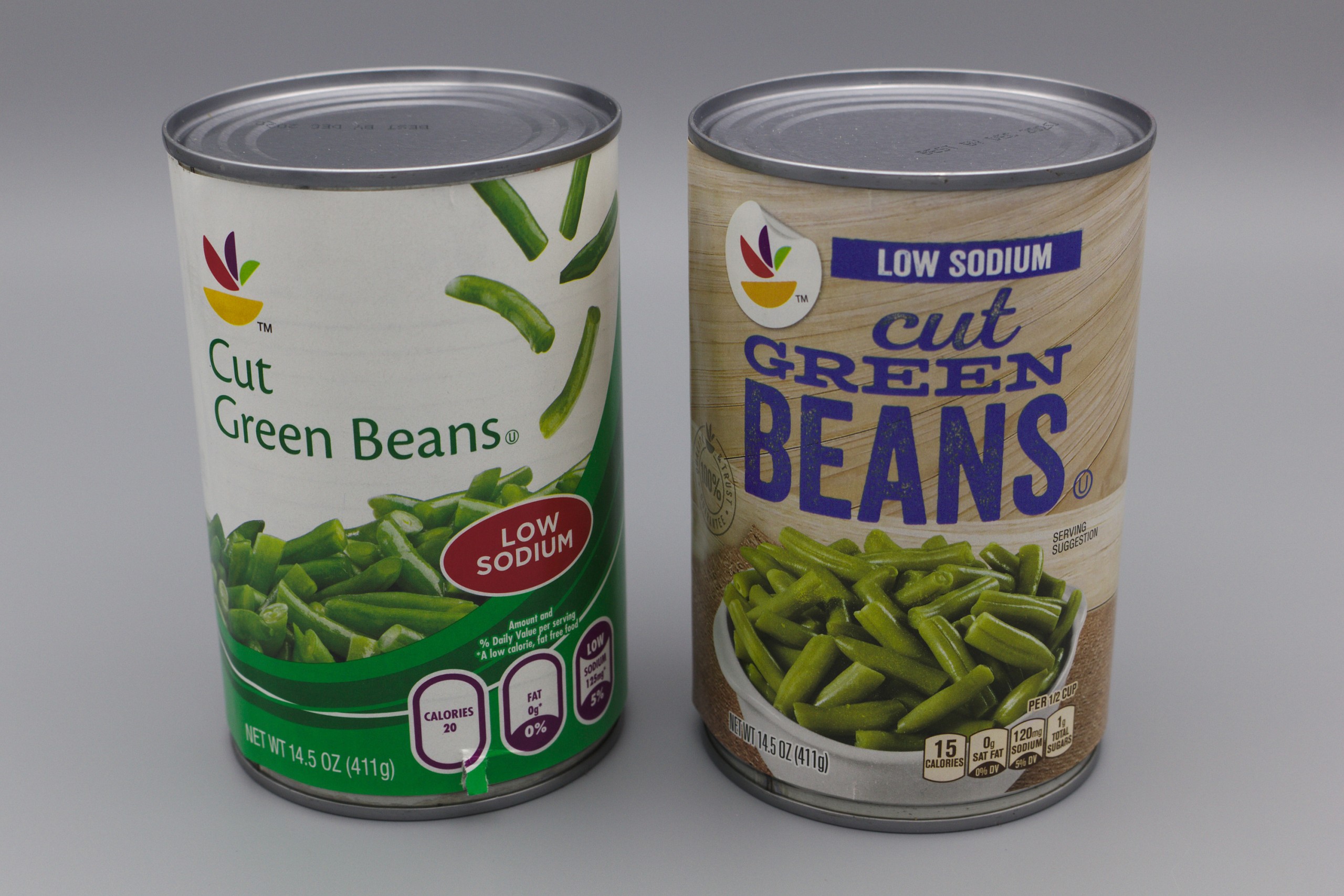
In particular, I will focus on the labels for canned vegetables. As one would expect, both the old and new label designs feature the name of the vegetable along with a picture of a “serving suggestion.” Since many vegetables are similar in color, it is often easier to find one’s desired vegetable on the shelf by looking for the name, especially when a particular vegetable comes in multiple variants, such as green beans (whole, cut, diagonally cut, and French style). The old design featured a plain sans-serif font in a dark color on a solid white background, resulting in good contrast and readability. The new design, however, is a clear regression; it trades the consistent, easily readable font for a hodgepodge of different heavily-stylized display fonts on a busier background with lower contrast, which results in much worse readability. This loss of readability makes it take longer to locate a particular product on the shelf.
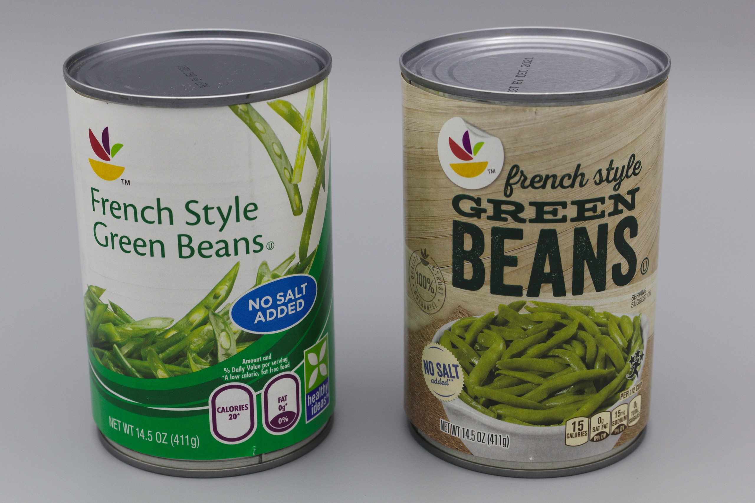
Many of the vegetables come in three variants, regular (“full salt”), low sodium, and no salt added. In the old designs, these were marked using text in a brightly-colored oval. Blue was used for no salt added, and red was used for low sodium; the regular variant did not include an oval. This design allowed one to quickly differentiate between the variants on the shelf. With the new design, these colored ovals were eliminated. The low sodium variant trades the black text on the regular variant for bright blue text and a distinctive blue bar above the text with a clearly readable “low sodium” label. This is an improvement over the old design as it makes the labeling more distinctive and easier to differentiate. Unfortunately, the same is not true for the no salt added variant, which, for some inexplicable reason, is labeled the same as the regular variant except for a small, blandly-colored circular badge in the corner. Instead, it should have been labeled with a distinctive color and a bar with a clearly readable “no salt added” label, similar to the low sodium variant, except using a different color.
The font size was increased for the ingredients list, which is one of the only improvements in the new designs.
It’s the closest I’ve seen to what’s suggested by xkcd: Brand Identity. ↩